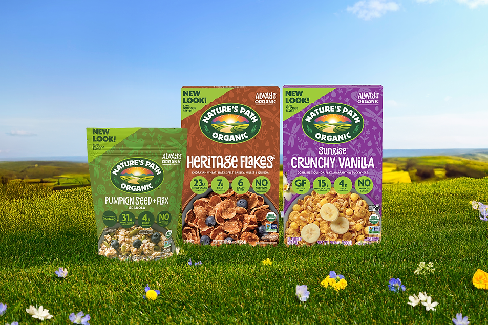

RICHMOND, BC. — Nature’s Path Organic Foods is rebranding its packaging and logo in honor of the company’s 40th anniversary.
The new design introduces a “bolder, more prominent” logo alongside an updated and consistently placed “Always Organic” lockup, centralized claims housed in unified roundels for clearer shopper recognition, an ecosystem-inspired background design, and top-down food photography meant to highlight “real ingredients and crave-worthy texture,” Nature’s Path said. The company said the refreshed branding makes its products easier to spot in crowded breakfast and snack aisles while also “reinforcing Nature’s Path’s enduring commitment to organic farming and environmental stewardship.”
The rebrand would also unify Nature’s Path brands such as EnviroKidz and Love Crunch under “a more streamlined, consumer-first design system.”
“For over 40 years, our purpose has been simple: to make delicious organic food that nurtures people and the planet,” said Arjan Stephens, president of Nature’s Path. “This refresh isn’t about changing who we are — it’s about continuing to resonate with today’s families and show up as a simplified, more cohesive partner on shelf while staying true to our Always Organic heritage.”
The new Nature’s Path redesign will roll out at US retailers starting April 1. The company also said it would introduce new product innovations later this year.
#Natures #Path #undergoes #brand #refresh